Sweet Bird Bakes
logo & brand identity redesign | April 2025
Sweet Bird Bakes is a cottage baking brand in North Dakota, founded by Maria Kincaid. What began as a way to cover vet bills for her dog Chewy has grown into a true passion, with Maria now selling home-made breads and jams at her local farmers market each season.
Maria first reached out in 2020 for a quick-turn logo solution—something that worked in the moment but lacked strategic depth. This time, we took a more intentional approach: defining the heart of Sweet Bird Bakes, crafting a brand identity that reflects Maria’s warmth and personality, and ensuring it’s flexible across all types of media.
Strategic Overview
Sweet Bird Bakes is dedicated to fresh, high-quality breads and canned goods made with local ingredients. With a focus on authenticity and creativity, the brand stands out through its small-batch, preservative-free offerings and a warm, personable customer experience.
Strategically, Sweet Bird Bakes is built to resonate with people who value homemade quality, community connection, and unique flavor. By leaning into its artisanal roots and approachable identity, it fills the gap between mass-produced goods and meaningful, local food experiences.


Visual Identity
Logo Design
The Challenge
Sweet Bird Bakes needed a logo suite that could flex across a wide range of uses—from labels and packaging to social media and web—without losing its personality or legibility. The previous logo lacked strategic depth and didn’t scale well for small applications.
The Approach
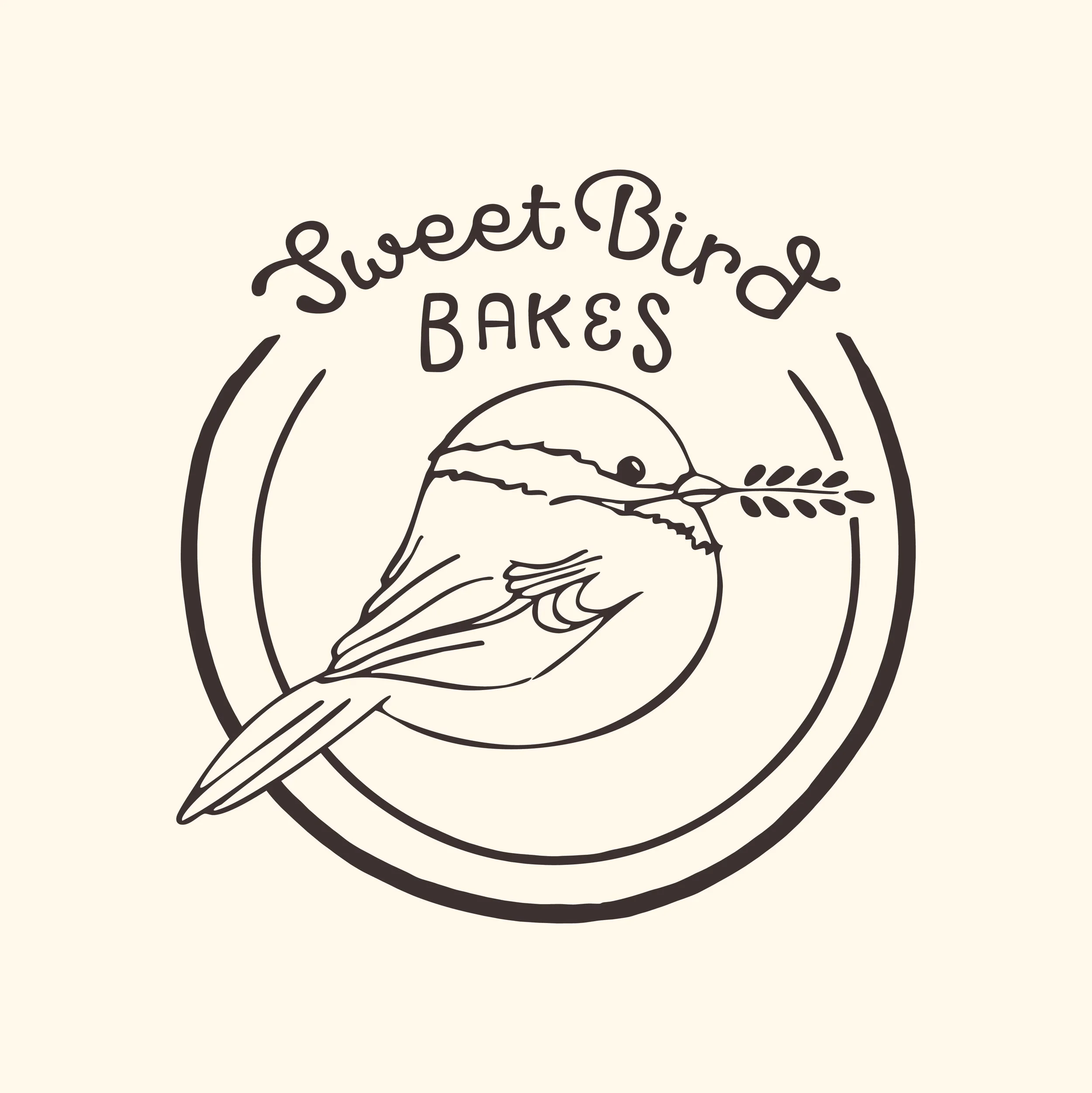
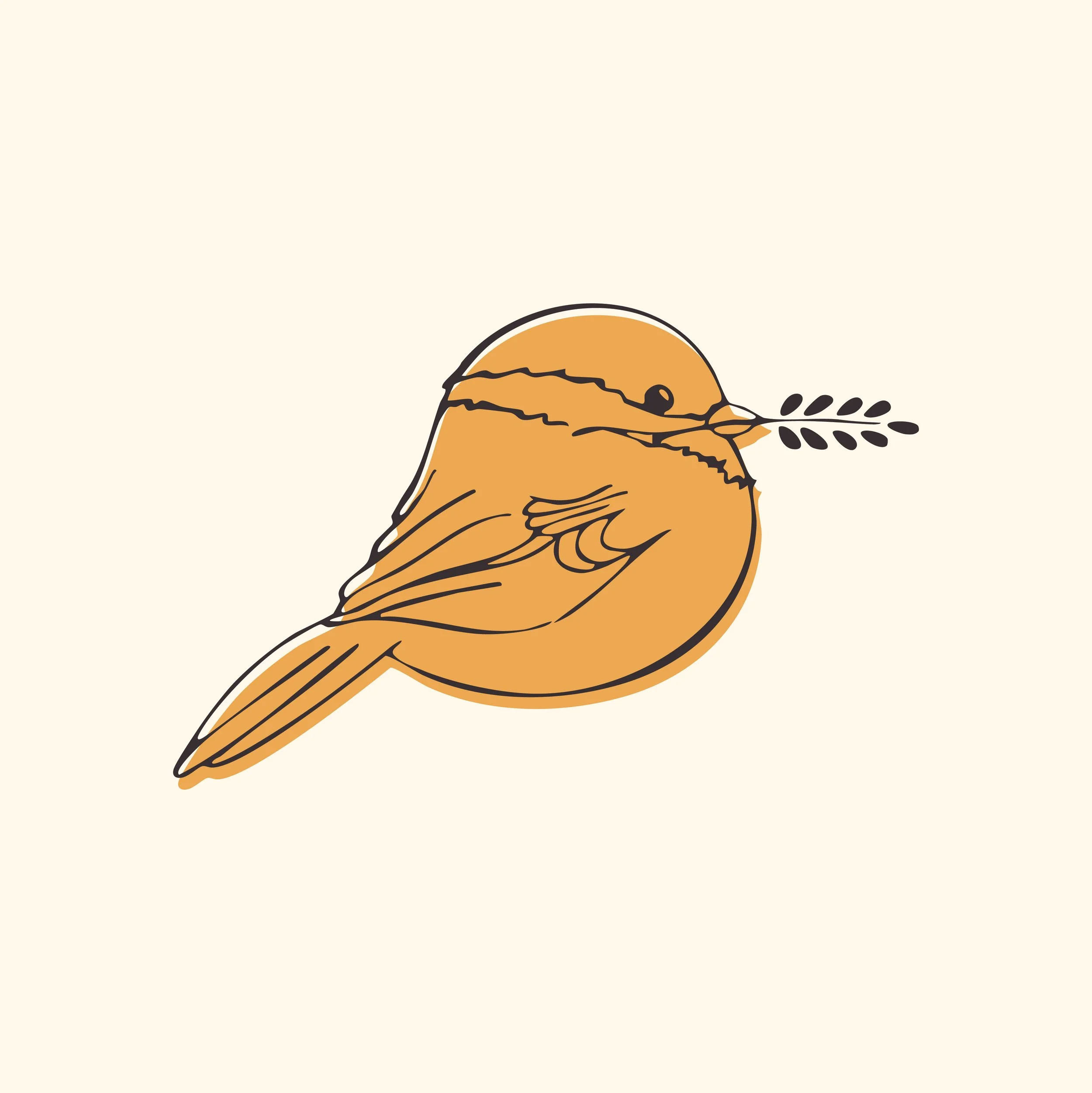
I designed a badge-style primary logo that balances charm and clarity. It features custom hand-drawn type paired with an illustrated chickadee mascot, “Sweetie,” who holds a grain of wheat—symbolizing the brand’s homemade, comforting roots. The type styles and layout evoke a rustic, approachable vibe that mirrors the warmth and creativity behind the brand.
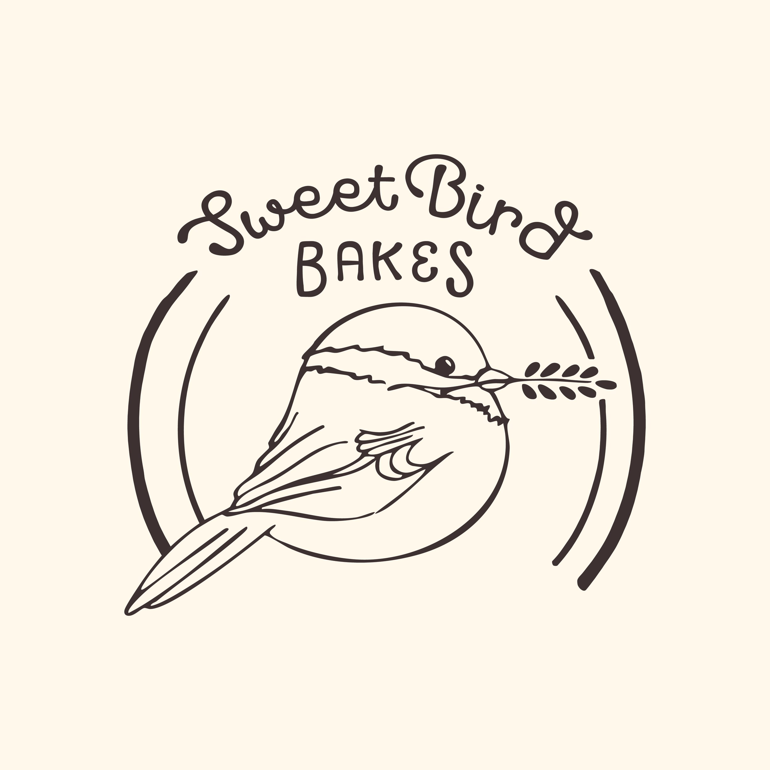
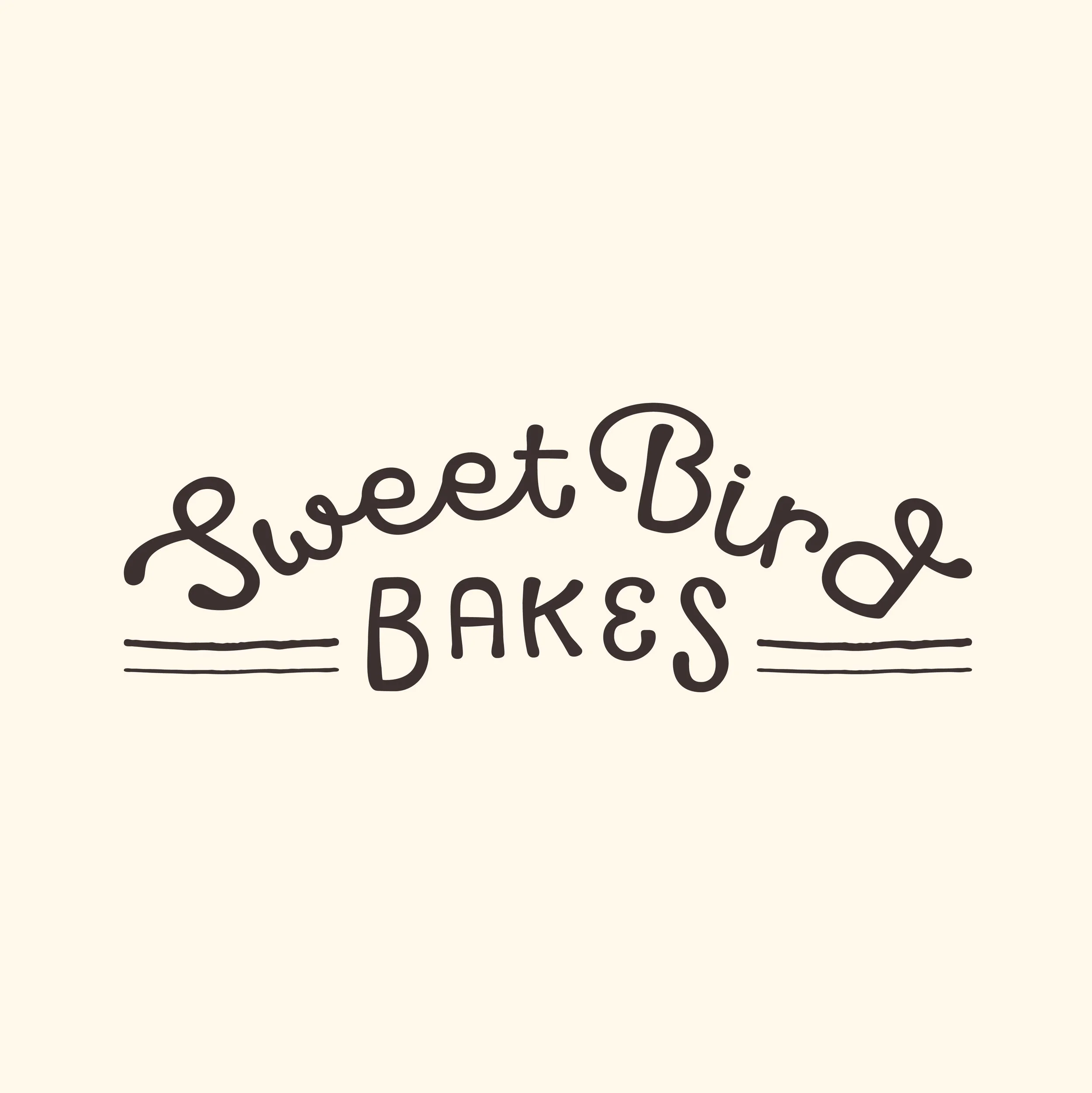
To enhance usability, the badge includes a built-in notch for label information, allowing the logo to integrate seamlessly with packaging. I also developed a horizontal wordmark for web and print materials, and a simplified mascot mark for tight spaces like stamps and profile images.
The Outcome
The result is a cohesive, flexible identity system that preserves brand recognition across every touchpoint—no matter the size, medium, or context.

Supporting Elements
The Challenge
Sweet Bird Bakes needed a cohesive visual system to support the new logo—one that would extend the brand’s personality into packaging, signage, social media, and digital experiences without feeling generic or overdesigned.
color
A warm, earthy palette—espresso, saffron, kraft—paired with fresh accents like jalapeño green and raspberry. It reflects the brand’s rustic charm and adds vibrancy without overpowering.
Typography
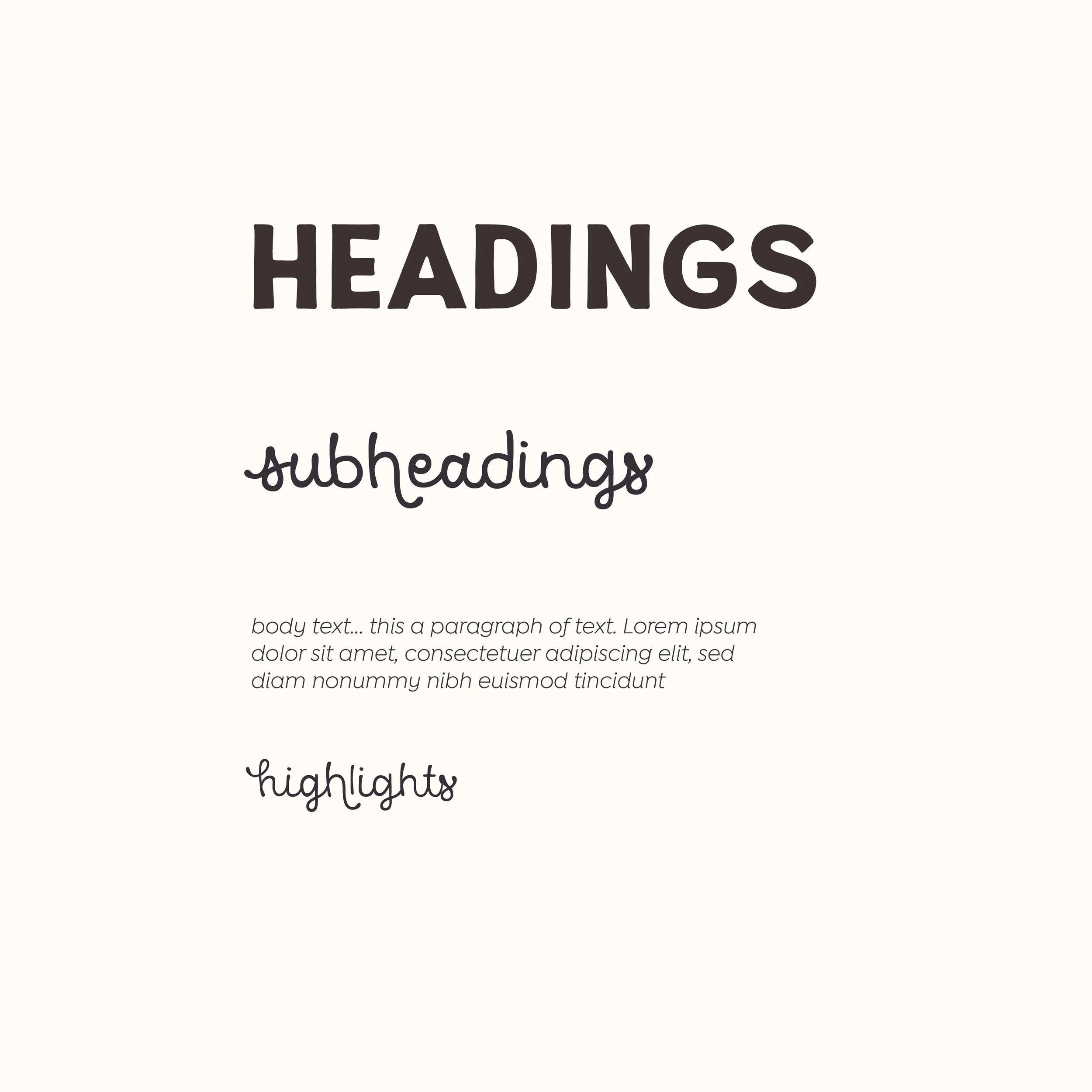
A hand-drawn type system combines a rustic sans-serif with a script subhead and clean sans for body text. It’s approachable, readable, and full of personality.
Icons
Simple, custom-drawn icons echo the logo’s linework. With baking tools, product symbols, and “Sweetie” the mascot, they add charm and utility across platforms.
Pattern
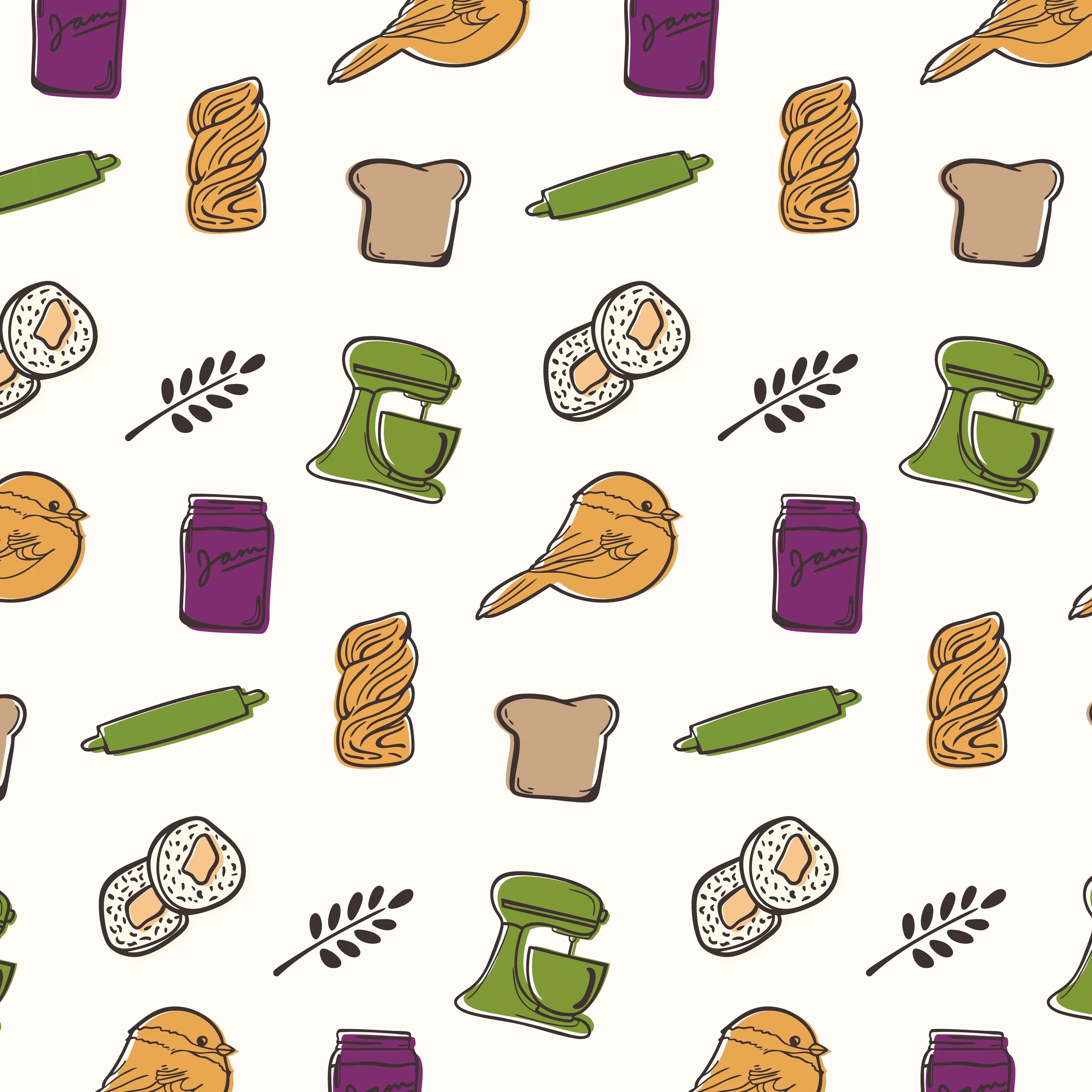
A casual, doodle-style surface pattern reinforces the handmade vibe. Ideal for packaging, wrap, or digital backgrounds—it brings warmth and cohesion to every touchpoint.

I came to Something New Designs looking for branding for my baking business, and all I really had was a name and a vague idea of what I wanted. Sam took my ideas and feelings and made more beautiful logos than I ever could have dreamed of. Every draft was better than the last, and every suggestion, no matter how unclear it was, was thoughtfully considered and talked through with me. She also talked me through what she thought would be the best uses of each logo, how they should be displayed, and made sure I had all the different files I needed to make signs, labels, and t-shirts. Sam really is magic when it comes to illustrations and branding!
Maria of sweet bird bakes
